Posts by Mr S

    I have spoken to Red about this before and it is possible to turn off the texture with the following command:


    Stand next to the poster you want to change and aim at it. Then enter the command: edit attribute disablenormal


    It is a permanent fix for me but it is per poster. So each poster has to be fixed manually.


    However Red also told me that the texture will eventually be an option or deleted in a future update. He said he wasn't able to get it ready in time for the latest update but hopefully it will be in the next.


    Hope that helps :)

    Hi Red,


    I just ran into a problem. I have been building a structure and noticed that the brick block I am using (ID: 345) comes with a flickering noise/speckle effect. I have shown this in the images provided.


    What's really strange is that on the outside wall facing north, I can't see it at all. Everywhere else I can see it.


    The wood blocks (ID:159) on the floor look fine. Viewing from above at least. Also I built a white concrete wall (ID: 607) as a test which looks better, but I still noticed it slightly. The dark bricks seem to show it worse. maybe due to the speckle being white but it really does seem less. Maybe all building blocks have this issue?


    It looks like the speckle dots and dashes are following the joins between the bricks but I'm no expert. Every time I move the camera, they flicker and move rather aggressively. Still images don't really show how strong it is. I will need to replace all the blocks with something else as I can't really deal with it lol.


    Hopefully we can fix this somehow.


    Many thanks for your continued hard work :)


    Close up of one of the many white dashes on screen.


    The dark bricks show many speckles but the white wall doesn't appear to have any. However the white wall did show some on close inspection. Only very slightly though. You can see the floor bricks, both stone and wood. look fine actually.


    Strangely, this view doesn't show any speckle.


    This view doesn't show any speckle. It is just inside the wall from the previous image.


    The floor here seems ok.


    This wall is also ok.


    Big white dash line above the crosshair and more speckles on the wall.

    Thanks for your feedback :) I'm sorry to hear about the crash though... unfortunately the game quickly runs out of memory for bigger worlds :/ It's a bit tricky to fix, because the game has to load all chunks in order to convert worlds properly... but we're working on that. As a workaround, you could set up a bigger swap file in your OS to allow the game to allocate more memory... or alternatively wait until we have a fix for this (but unfortunately I have no ETA yet)...


    About the posters, we've been working on an option for that, but unfortunately it didn't make it into this update... but it's on our to-do list :)

    Thank you red51, for your quick and helpful response. I am so grateful :) No rush, I'm sure everything is in good hands and under control! Keep it going, Much appreciated 👍

    Update is working very well so far, all the issues I had have already been fixed. Only one of my worlds couldn't be converted and the game crashed during the process several times. All other world worked very well though.


    Loving the higher resolution posters/setting in the option menu. I was wondering if that texture on the posters will be made an option or deleted? As it can make the images look a little unclean, for certain use cases. For example if I make a fake window underground. It doesn't look so clean or real. I can see how it looks good for some paintings, tapestries or scripts etc. However I always find myself removing it with the command.


    Thanks for all your hard work red51 and team, Rising World is the best! Absolutely stunning :)

    Is there a way to increase the poster resolution? In Java there was, but with the Untity version I don't know where to set it.

    With huge posters, a blur doesn't look pretty, smoothing it doesn't change the sharpness.

    Deirdre Yes I have also been trying to get this to work. The command is 'setoption customimageresolution <resolution>' but I am have a lot of trouble getting it to work or at least I don't understand it.

    Red51 has kindly given me some great information which you can see on the English update post.

    I have just posted some information too, regarding my experience so far, if it might be of some help to you.

    If you can make it work, let me know :D

    It would be awesome if we could have some image resolution options to select in the poster image menu. It could help aspect ratio too.

    You can also change it in singleplayer on the fly by typing setoption customimageresolution <resolution> into console

    red51 I think I'm doing something wrong here hehe. Everything is in single player. I seem to have set the resolution to 256x256 by typing 'setoption customimageresolution 256' but I don't know how it worked because it didn't seem to take effect until I loaded up the game 2 days later. The images were still 512 for that whole session after the commands. The command showed up as green text to I assume that means it's correct but it didn't do anything. 2 days later I placed an image and then realised it was 256 which was so strange. I didn't apply any commands on that day. I also tried 1024 resolution as well but haven't been able to get it to work yet. I must be doing it wrong. Do we enter the command, then upload the image? I have tried this many times but it hasn't worked. Or place the image and then focus on it and enter the command? I have tried so many different things but I have no idea how to make it work lol. In my image menu, it says the first 4 images are 512 from a couple of days ago. Then the first one I uploaded today says 256. I must have somehow set it before I logged out last time but no idea how I did it. So two different resolutions in the same menu which seems to suggest changing the resolution needs to be done before uploading the images. However I can't seem to get it to work like that. Trying multiple versions of the same image and new different images. Tried reloading the game every time too, that doesn't seem to work either. Any help would be much appreciated :)

    That really are resolutions availble atm? I'm used to play 4k, as possible and not amused to use early tv resolutions. I haven't try it right now, so sorry, if Im wrong..

    Deirdre Oh I mean for 'poster image resolution', not for the actual game resolution. I think that is what you mean? Yes my game resolution is perfectly fine, I also play in 4k :) But the posters are all 512x512 as far as I can see. Or maybe I didn't understand what you meant hehe.

    red51 Are the posters fixed to 512x512 resolution? I'm wondering if we could have a few options such as the original resolution of the image, or some fixed resolutions as well that the game seems to have already. Like 512x512, 1024x1024. 1920x1080 and 3840x2160 etc.

    Basically any very common image resolutions plus original image.

    This might also help with the aspect ratio of posters (using original image especially for rare resolutions). My posters all look squished as they start as 1:1, even if they are meant to be vertical 16:9 for example. So I am trying to guess the correct aspect ratio by resizing.

    I really have no idea if any of this is possible or realistic to add so I apologise if this is way to crazy to add to the game.

    I suppose there might need to be some sort of cap for original image lol. Not sure what massive resolutions would do to the game! Up to 4000x4000 might be cool, to include up to 3840x2160 preset plus 4000x4000 for 1:1 images. I guess that's a common ratio.

    I seem to remember the Java version having much higher resolution poster image capability. I think the posters were much sharper, especially when very large size. I could be that I remember wrong.

    I realised when placing posters in my world (Unity) that the resolution was greatly reduced. I tried to place a 6k photo but it said it was only 512x512 on the image screen.

    Love the latest Hotfix by the way, so awesome :) Cheers

    @red51

    I noticed that there is a texture on the posters when they are placed in the world, which goes over the images, to give it that 'material look'. Is there a way to place a poster without this texture, so it's just a clean image with no additional texture?

    I remember that the Java version had clean/smooth images for posters (I think?). I much preferred this as then posters can be used as realistic custom textures or just much more clear/sharp images.

    It would actually be cool if when selecting a poster to craft, it would list a couple of options for smooth poster or textured poster, maybe even glossy poster or whatever is suitable.

    A bit like when crafting a block and choosing it's shape from a list of possibilities, if that makes sense.

    Perhaps it could be done by crafting paper posters instead of cloth posters, or something like this.

    If there is a way of deleting the material texture in the files, that might be useful as a way around it, if only temporary?

    Apologies if this is already in the game and I have missed it!

    Many thanks and love the update. Rising World keeps getting better and better!

    I am getting stuck at the top of the scaffolding ramp every time I walk up it. I will provide pictures of the scaffolding piece for clarity. By getting stuck, I mean that I can't get past the top of the ramp without jumping. It seems to be due to the design of the scaffolding piece, as opposed to it being a bug, as the ramp actually connects under and behind the edge of the platform. So the edge of the upper platform gets in the way, like an obstacle that needs to be jumped over. I hope that makes sense but the pictures display this. I wonder if the ramp should perhaps connect flush with the horizontal platform/board at the top, to allow for a smooth transition between the ramp and the upper platform. So we can walk up the ramp to the upper platform without any jumping required. I feel that this would be a much nicer experience for all players. If it is a design choice or necessity, I understand and respect that of course.
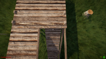
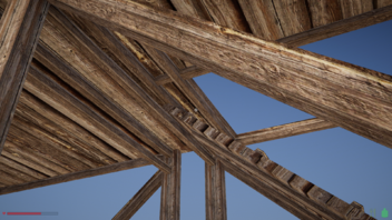

    I have also found a couple of issues with the hatch scaffolding piece. Or if not issues, I may be making a mistake. I tried to take Pictures of this also but my pc suddenly stopped working lol. So I'll try to explain as best as I can.

    Firstly when I aim to place the hatch in the hole of the square tower scaffolding piece with the ladder, and press right ctrl, the hatch turns and fixes 90 degrees automatically, rather than staying in the original position to then be adjusted. Because of this 90 degree rotation, it can't open as it is obstructed by the frame or platform on the tower. More on this in the next paragraph.

    Secondly, the hatch seems to lock into 1 orientation in this tower hole when I aim it into position, to that I can't rotate it with the left and right arrows. Which might ok, however I feel like the hinge should automatically fix to the opposite side to the ladder, as the ladder side is where the characters hands are to push the hatch up and climb through the hole. If that makes sense. It seems more natural and realistic to me at least. Currently the hinge fixes to the ladder side, for me at least. If it was rotatable, it wouldn't matter of course, but I cant rotate it. I do understand that the design of the tower only allows for 2 orientations of the hatch, as if it is rotated 90 degrees, it is obstructed by the side of the tower platform and can't open. It would be cool if it was at least rotatable 180 degrees so it could still open in 2 different orientations. Or even better if the tower was adjusted to allow the hatch to operate in all 4 orientations. For maximum customization and ease of use.


    Hope this helps somehow. I really love the update as always, the scaffolding and the chests being my personal favourite parts of it :) Nice work! Cheers!

    Oh wow that has made an amazing improvement, thanks Red51! I will attach a couple of images to show you, but the GPU utilisation stays the same, both in and out of the menu now! So much better :) The GPU is silent and cool now, thanks so much. Yes it would be awesome if this was at some point implemented into the game officially, if it's ever appropriate :) Cheers 🙂👍👍


    As you can see in these two screenshots, I found that the menu causes my GPU to run at 99% utilisation every time I press the Esc button and open it. This includes the initial escape menu and the settings menu, as far as my testing has gone. My average gameplay utilisation can be seen here as around 70%. It's now much lower actually, 55% - 60% average after I adjusted graphics settings. But the menu still maxes out the GPU every time. The temps of course seem to increase a lot too and the fans start spinning louder which I suppose backs up the evidence a bit. Would it be normal when opening the menu to reduce GPU utilisation a lot, rather than increase it?

    The main menu, when the game is started, runs better at around 45% utilisation for me.

    I have submitted a report in case it might help.

    I have both the game and my GPU limited to 60fps. I run everything in 4k and use an RTX 3080.

    Hopefully we can sort it out somehow :) Thanks in advance for any help you can offer.

    Thanks Red51, just done some testing in regards to what you advised. An old world and a new world. Actually it all seemed ok. So at 4k res my GPU was at 98% load. At 1440p my GPU was at 60% load. So very excited for DLSS! However both resolutions performed very well. I do have my system currently limited to 60fps to keep temps and power draw lower. I tried all 3 weather changes in 4k it stayed in the 50-60 fps range. Dropping slightly compared to clear weather, but not much. It only dropped into the 40's once. Clear weather was 58-60fps. So actually there probably isn't a problem that requires sending a report? I may have had the fps limit set to 120 before though lol. I'm not so good at these things, sorry if I wasted your time. Hopefully this was somewhat useful but many thanks for your help anyway, it was very interesting to test at 1440p! Looking forward to the NPC update and DLSS sometime in the future :)

    Hi Red51 and everyone,


    I noticed that DLSS is on the Trello Roadmap which I am very excited for. Just wondering if this is still on the cards as a future addition to Rising World (new version).


    My performance has actually been very good (in 4k), however when the wind picks up, I get significant frame drops, possibly caused by the grass movement as it blows in the wind? Or maybe something else. But it only really occurs in bad weather anyway. Maybe rain too actually.


    I'm assuming DLSS will in general help this by reducing overall demand on the GPU. But would there also be any general optimisation updates coming to help this too?


    Many thanks, keep up the good work. Love this game!

    Hi everyone,

    I have run into a bit of trouble with aligning building materials properly.

    Referring to the images here, I'm confused as to how I can't seem to line up the horizontal beam on the left, with the vertical beam in the centre. It's just so slightly off that if I move it at all, it only gets worse.

    I was able to line up the beam on the right perfectly and did all this work using the 'snap' mode and manual positioning.

    In the image with grid mode 'on', you can see that the beam is a tiny bit off the grid line. How is this possible?

    Could I have perhaps placed my foundations or something else in the chain without grid mode enabled and messed it all up?

    Thanks in advance for any help!

    I'm wondering if we will get more efficient ways to flatten terrain, for example a steam roller or a bulldozer. Maybe a tool that can be towed by horses.
    Flattening terrain in survival takes a very long time at the moment. Laying train tracks might require a lot of raking!


    Looking forward to the next update, thanks for all your hard work!

    @Minotorious is right, things like weapon racks or tool racks (to hold tools instead of weapons) are definitely planned ;) We are also thinking about a way to place items in the world (anywhere you want), but we're concerned that a high amount of placed items might cause performance issues for the server :/ Nevertheless, it's on our list^^

    Yes this idea of a "visual inventory" by using weapon/tool racks or stockpiles for wood and stone adds so much to a game. Games like Medieval Engineers and Stationeers use visual inventories. Being able to place items anywhere in the world would be very tasty also. I hope it wouldn't be to damaging to performance.