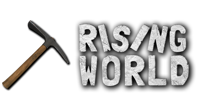
Hello!
There is my proposition of the new logo ![]() I can also help to correct HUD for free.
I can also help to correct HUD for free.


Hello!
There is my proposition of the new logo ![]() I can also help to correct HUD for free.
I can also help to correct HUD for free.


Looks very nice! Is there a way to integrate a pickaxe for consistency to the old logo?
Thanks! The name of game is really long and when i give next element (like pickaxe) logo will be look a compressed ![]()
May be the pickaxe could be on the name ![]() (with a little transparency)
(with a little transparency)
I like the current logo with the pickaxe very much, so the proposals of @Yaromid and @Helie have my thumps up ![]() And I would prefer the name is more or same transparency as the pickaxe.
And I would prefer the name is more or same transparency as the pickaxe.
Would it be possible to do it like the word "Rising" is above the handle of the pickaxe, the word "World" below the handle of the pickaxe? I am no graphic specialist, but imagine the ) and / is the pickaxe, it could be like this?
.......)
........)
Rising./.)
....../
...../World
Edit: had to add dots, the spaces were deleted when I clicked on Send
Don’t have an account yet? Create a new account now and be part of our community!

