My Suggestions For The Unity Version

  • Here is my small list of suggestions that I came up during tests of the RisingWorld Unity version. Most of them are visual only and will not affect gameplay, but some of them can be "Quality Of Life" enhancements.


    1. Normal & Texture Blending for objects on natural terrain


    This technique can be applied to construction elements and objects that have contact with terrain. The reason is to make objects more "natural looking" like they are really interacting with terrain.

    This effect can be done only with shaders and it can be toggleable to improve performance on low PCs.


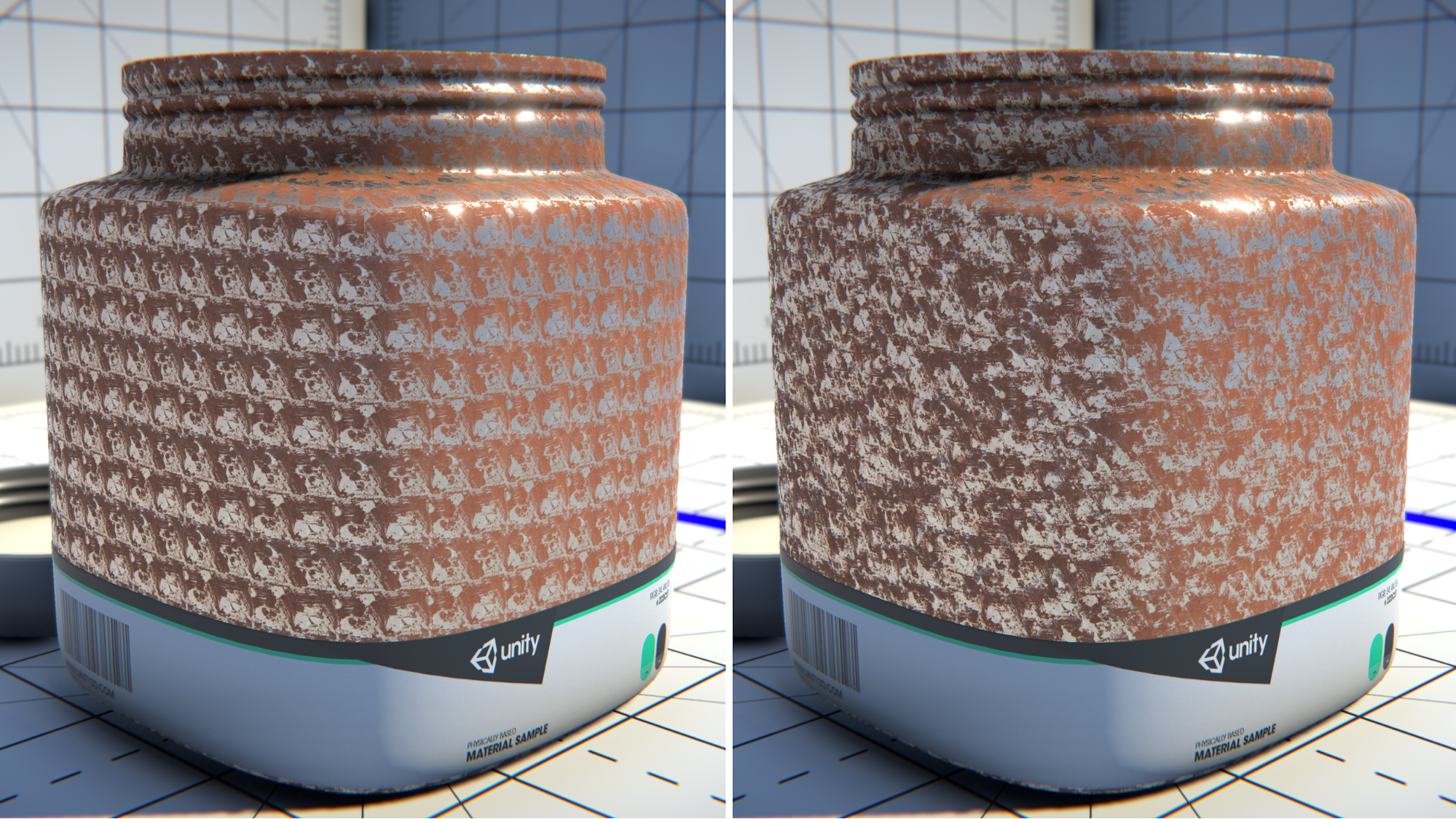
    2. Stochastic textures for natural terrain (and probably some materials)

    This thing is about creating large no-repeatable texture patterns from one image (in shader), so they don't look tileable anymore. It can be applied not to any material, but many natural substances like stone, sand, gravel, soil, grass and so on can use it. This can make large scale terrain (like mountains) look better.

    Unity blogpost about these textures.


    3. No-intractable debris from object

    Looks like right now "physical debris" from all objects can completely break player interaction with world, for example if you will use pickaxe in front of debris - it will destroy debris piece and not object behind it. I think this is a bit unbalanced behaviour as right now debris is a visual option. So, my suggestion is to make it ignorable by all raycasts and interactions so it will be more like 3D particles than real objects.


    4. Mouse scroll enhancements.

    Mouse wheel can change cells on the hotbar, but the problem is that it probably doesn't always behave as you expect from it. For example it will not switch hotbar cell if you will spin it too fast. And if it will change - it will change only one cell. My suggestion is to make it similar to other games (like Minecraft, for example) where you can smoothly change all hotbar cells with one spin instead of constantly pausing between them or moving wheel very slow.


    5. Increase shadow bias (or make it configurable)

    There are some cases of shadow bleeding of some surfaces. If shadow bias will be a bit larger - light will have less artifacts. It probably can be configurable inside graphic settings as different shadow resolution probably require different values.


    Small bug at the end of list - shader distance will be reset on every game re-launch to default value. I didn't test other values but this bug can probably have same effect on other graphic settings.
  • Thanks for your suggestions :)


    1. Normal & Texture Blending for objects on natural terrain

    We have been thinking about something like that in the past, but I don't think the performance impact is really worth the effort... We barely have natural elements like on the screenshot (i.e. elements where a large portion of them is covered by terrain), and on the few remaining elements where such a technique makes sense (e.g. rocks), the effect would be barely noticeable in RW I guess. In RW there are probably only very few situations where such an effect really pays off...


    2. Stochastic textures for natural terrain (and probably some materials)

    While this is a great technique for natural looking materials, I'm not so sure if RW would really benefit that much from it... It has an impact on performance, especially when combined with triplanar mapping (which is used on our terrain). We're already using a distance-based tiling which reduces tiling on mountains, and while this is far from being perfect, it seems to be at least sufficient on naturally generated terrain. One still notices tiling on flat surfaces (like the current area surrounding the demo mountain for example), but after the world gen update, that area is covered by water anyway.


    But this is something we may implement in the future ;)


    3. No-intractable debris from object

    Looks like right now "physical debris" from all objects can completely break player interaction with world, for example if you will use pickaxe in front of debris - it will destroy debris piece and not object behind it. I think this is a bit unbalanced behaviour as right now debris is a visual option. So, my suggestion is to make it ignorable by all raycasts and interactions so it will be more like 3D particles than real objects.

    We could maybe introduce an option for this ;) The original idea was to give the player a way to remove debris manually (considering it takes some time until it despawns automatically, depending on the settings), especially if it obstructs the view :thinking:


    4. Mouse scroll enhancements.

    Mouse wheel can change cells on the hotbar, but the problem is that it probably doesn't always behave as you expect from it. For example it will not switch hotbar cell if you will spin it too fast. And if it will change - it will change only one cell. My suggestion is to make it similar to other games (like Minecraft, for example) where you can smoothly change all hotbar cells with one spin instead of constantly pausing between them or moving wheel very slow.

    I fully agree on this. Scrolling definitely needs a rework so it behaves like in the Java version ^^


    5. Increase shadow bias (or make it configurable)

    There are some cases of shadow bleeding of some surfaces. If shadow bias will be a bit larger - light will have less artifacts. It probably can be configurable inside graphic settings as different shadow resolution probably require different values.

    Most of our lights have a unique bias setup... we could introduce a configurable global factor for this, but I'm not sure if there is a value that fits all situations...

    Is there a specific light you where you've experienced any bleeding or artifacts, or could you maybe share a screenshot of a situation where this happens?


    Small bug at the end of list - shader distance will be reset on every game re-launch to default value. I didn't test other values but this bug can probably have same effect on other graphic settings.

    Oh, thanks for letting us know, this is indeed a bug! We'll fix that with the next update :)

  • Is there a specific light you where you've experienced any bleeding or artifacts, or could you maybe share a screenshot of a situation where this happens?

    Seems like one of old artifacts - "shadow acne" - is not present anymore (probably related to Unity version), or it require specific conditions that I can't recreate anymore. But another bug - light bleeding - can be recreated. Conditions are many modern light sources on large walls and reflective material under them.


    Another suggestions that I forgot to mention:


    6. Increase maximum lights count in settings

    Sometimes maximum number in 50 lights is not enough for large buildings, probably if user have powerful PC it will be good to have more light in the scene.


    7. Handling of distant lights

    At this moment distant lights are not visible (or cutted due to light amount limit). It will be great it will be possible to bake their light (for example into large-scale voxel grid) or have lights without shadows

  • Seems like one of old artifacts - "shadow acne" - is not present anymore (probably related to Unity version), or it require specific conditions that I can't recreate anymore. But another bug - light bleeding - can be recreated. Conditions are many modern light sources on large walls and reflective material under them.

    Oh, actually this seems the be rather caused by the shadow resolution :wat: The recently added lamps use a very low shadow resolution (6 shadowmaps with a resolution of 32x32 px)... we wanted to keep it as small as possible so all shadows fit into our shadow cache. It seemed to be sufficient in most cases, but apparently a higher resolution is needed to avoid situations like the one on your screenshot...


    We ultimately want to provide more control over these things. Right now the shadow quality setting only affects the sunlight shadows, but changing that is definitely planned :)


    Sometimes maximum number in 50 lights is not enough for large buildings, probably if user have powerful PC it will be good to have more light in the scene.

    I agree that having a higher limit would be definitely helpful.


    At this moment distant lights are not visible (or cutted due to light amount limit). It will be great it will be possible to bake their light (for example into large-scale voxel grid) or have lights without shadows

    We have been thinking about rendering distant lights without shadows, but sometimes this may yield undesired results (lights going through walls, illuminating areas which are supposed to be dark)... :/


    I got it too

    Oh, this is weird :wat: Does the light come from a lantern, or is it a colored lamp? It looks like the lamp is placed under the floor, is that correct? What size does the blocks on the floor have, i.e. what thickness?

  • Oh, this is weird :wat: Does the light come from a lantern, or is it a colored lamp? It looks like the lamp is placed under the floor, is that correct? What size does the blocks on the floor have, i.e. what thickness?

    its a lantern and the block is 1 - 1 and the thickness is like 0.03 or 0.04

  • its a lantern and the block is 1 - 1 and the thickness is like 0.03 or 0.04

    This is unfortunately a technical limitation :/ When walls or ceilings are too thin (< 0.2 or 0.3), it's possible that light still bleeds through. This is a direct result of the shadow map resolution. Even if we would use a very high shadow map resolution (which would result in serious performance and VRAM issues if many lights are placed in the scene), you would still experience light bleeding on very thin walls... If you make the floor a big thicker (e.g. 0.3), the bleeding should mostly go away though ;)

  • Some more suggestions that I have:


    8. Hide grass if it is under construction element

    I think it will look better if grass under construction element will be not visible, this can help with building thin floors or other structures


    9. Move items up if they are below terrain

    Sometimes when you break element its center will be below terrain, and as a result - summoned item will be dropped below terrain into the void. Suggestion is to moved it to the nearest point of terrain above it, and the player will not lose any resources anymore.


    10. Change size of construction elements on icons

    Construction elements can have different sizes, but this is not shown on their icon which sometimes makes their identification difficult. If the icon will have same outlook as an element in the world it will be much easier to define what elements you have in inventory


    11. Make some construction elements possible to attach with snapping tool

    Some elements (Wall Torch) are not possible to place with snapping tools which makes them much harder to place (compared to modern lights)

    And if you will enable grid snapping instead Wall torch will be inside the wall until you make the grid really small

    My suggestion is to give it same snapping as for modern lights.

  • 8. Hide grass if it is under construction element

    Hehe, well, unfortunately there is currently a bug which prevents the "grass occlusion" to work properly :saint: Usually it only works if you actually stand on the ground, but if you're at a slightly higher elevation, it no longer works (resulting in grass being visible through construction elements again). But we will fix that ASAP :)


    9. Move items up if they are below terrain

    Sometimes when you break element its center will be below terrain, and as a result - summoned item will be dropped below terrain into the void. Suggestion is to moved it to the nearest point of terrain above it, and the player will not lose any resources anymore.

    Oh, that's not supposed to happen :wat: If blocks are slightly below ground (i.e. if their upper surface is still almost barely visible), they're supposed to spawn above the ground if removed via sledgehammer... this may not work properly on slopes though (if most part of the upper surface is covered by terrain, and if the distance between the center of the surface to the ground is too great)... this definitely needs some improvements. Or did you also experience that on flat ground?


    10. Change size of construction elements on icons

    Construction elements can have different sizes, but this is not shown on their icon which sometimes makes their identification difficult. If the icon will have same outlook as an element in the world it will be much easier to define what elements you have in inventory

    Well, the problem is that the size is not stored persistently for construction elements in your inventory...


    11. Make some construction elements possible to attach with snapping tool

    Good point, we will add a pivot for the wall torch with the next update :)


    And if you will enable grid snapping instead Wall torch will be inside the wall until you make the grid really small

    Yeah, the grid definitely needs a bit more love, especially when it comes to object placement. It's on our to-do-list ;)

  • Oh, that's not supposed to happen :wat: If blocks are slightly below ground (i.e. if their upper surface is still almost barely visible), they're supposed to spawn above the ground if removed via sledgehammer... this may not work properly on slopes though (if most part of the upper surface is covered by terrain, and if the distance between the center of the surface to the ground is too great)... this definitely needs some improvements. Or did you also experience that on flat ground?

    This bug happens on both flat ground and slope, I tested this on large construction elements (with height > 2), this happened on both mountain and gravel plain around it

  • Some more suggestions:


    12. Hide world loading from player

    Sometimes chunk loading can take some time before player will join the game, and this process is visible to player and can ruin game atmosphere. I think it will be good if the process of chunk loading and meshing will be hidden with world loading screen


    13. Add possibility to move item on hotbar by pressing numerical key

    I saw that feature in some other games and it is much faster than drag-and-drop item on hotbar, probably some players will like this more than cursor item movement

  • 12. Hide world loading from player

    This is on our to-do-list :D


    13. Add possibility to move item on hotbar by pressing numerical key

    I saw that feature in some other games and it is much faster than drag-and-drop item on hotbar, probably some players will like this more than cursor item movement

    Oh, this sounds interesting! Could you elaborate on that? Is this supposed to move the currently equipped item to a particular hotbar slot (e.g. when pressing numpad 1, the currently equipped is moved to the 1st slot, pressing numpad 2 moves it to the 2nd slot etc)?

  • Oh, this sounds interesting! Could you elaborate on that? Is this supposed to move the currently equipped item to a particular hotbar slot (e.g. when pressing numpad 1, the currently equipped is moved to the 1st slot, pressing numpad 2 moves it to the 2nd slot etc)?

    Yes, when cursor is over certain item in inventory pressing numerical key will swap selected item with hotbar item. For example if there is a pickaxe in inventory hovering cursor on it and pressing "1" will move it into first hotbar cell. The content of hotbar cell under "1" will be moved into the original inventory cell where pickaxe was

  • Some more suggestions:


    14. Use single click to pick up stack on cursor instead of holding mouse constantly

    I think this can be a small "quality of life change" that will reduce hand fatigue during inventory management.


    15. Allow stacks to be splitted inside chests

    I don't know is this a bug or not, but you can't split stack in chest, but can in inventory. Splitting them in chest can help a lot when you need to pick up a certain amount of items from chest.


    16. Split stack into cursor if it is empty

    It will be much easier to operate stack splitting if items will be given to your mouse cursor instead of empty hotbar/inventory cell. If this will be combined with suggestion 14 inventory management will become much better.


    17. Display chest content when it is opened

    It will just look cool if we can really see items inside chest during animation. It will also allow us create cool decorations like pirate chests or just show our cool loot in multiplayer.


    18. Add buttons for quick chest inventory management

    Buttons like "sorting", "merge stacks", "put similar items from inventory into chest" will make management much easier

  • 14. Use single click to pick up stack on cursor instead of holding mouse constantly

    We will definitely think about that. It requires a rework of our current drag&drop implementation, but the result could be worth the effort :thinking:


    15. Allow stacks to be splitted inside chests

    That's planned ^^


    16. Split stack into cursor if it is empty

    It will be much easier to operate stack splitting if items will be given to your mouse cursor instead of empty hotbar/inventory cell. If this will be combined with suggestion 14 inventory management will become much better.

    That would be a nice addition, but I guess that would only work well if it's really combined with suggestion 14... if we really implement suggestion 14, we will definitely also add this split handling :D


    17. Display chest content when it is opened

    It will just look cool if we can really see items inside chest during animation. It will also allow us create cool decorations like pirate chests or just show our cool loot in multiplayer.

    This a bit tricky to implement, but we will take that into consideration!


    Having that said, it will be possible to place items persistently in the world in a future update - so instead of storing certain precious items in chests, you could place them on a table or in a shelf :)


    18. Add buttons for quick chest inventory management

    Buttons like "sorting", "merge stacks", "put similar items from inventory into chest" will make management much easier

    It's on our to-do list, unfortunately this feature wasn't ready in time :saint: :D

  • Just some more suggestions :)


    19. Export furniture objects together with blueprint geometry (OBJ export)

    Right now export works only for construction elements geometry and will ignore all furniture, light sources and so on. Sometimes they can be important parts of buildings and without them buildings can be incomplete


    20. Make groups for different materials (OBJ export)

    All meshes are merged together into single group, as a result it will be problematic to texture object for rendering or other purposes. If object will be splitted into material groups with names of materials it can help a lot


    Just a small test pillar render, original pillar have 4 modern lights on all 4 sides and contains 2 materials - emissive and bricks

  • 19. Export furniture objects together with blueprint geometry (OBJ export)

    Well, that's unfortuantely a bit problematic :saint: We don't own all objects that are currently used by the game, instead some of them are just licensed (and we don't have an exclusive license for all objects)... if we offer an export tool (where people could basically just export a single object in order to get the model), that could result in copyright issues :silenced:


    20. Make groups for different materials (OBJ export)

    All meshes are merged together into single group, as a result it will be problematic to texture object for rendering or other purposes. If object will be splitted into material groups with names of materials it can help a lot

    I agree, that would be quite helpful! I'll put that on our to-do list :)

  • Some more suggestions, now for upcoming content - water. I don't know if this is in plans or not, so I will put it here as suggestions :)


    21. Water depth shading

    This can look great for large water areas like oceans, rivers and lakes. Under shading I mean changing light and fog color with depth increasing - deep waters get darker blue colors and denser fog


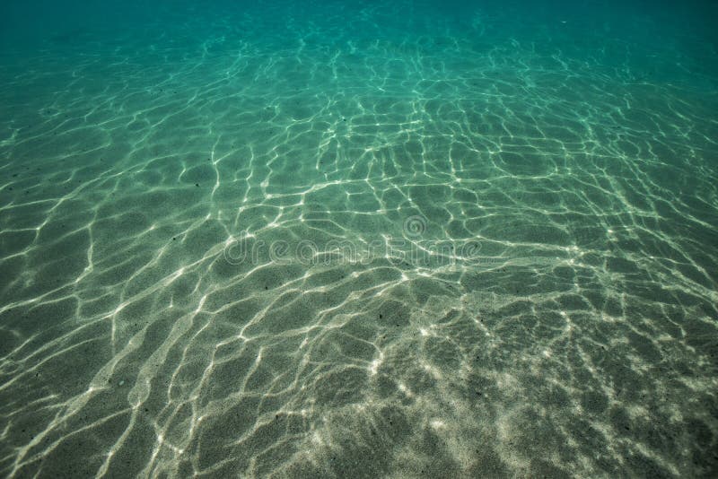
    22. Underwater rays

    This is a cool effect that can bring a lot of atmosphere to underwater. There are 2 possibilities how it can be created - with shader (probably with too large performance cost) and with particles (that are distorted sprites starting from water surface and moving together with sun)


    23. Fake Caustics

    Fake caustic (real cost too much) can add a lot of atmosphere to the see/lake/river floors (as caustic can be seen only on first 20-30 meters in water). There are also several ways of how they can be implemented, most of them are texture projection on the scene from sun position and multiplication with shadow map.


    Combining these effects together can create great underwater environment (and probably a place for players underwater bases or gigantic cities)

Participate now!

Don’t have an account yet? Create a new account now and be part of our community!