Rate this font 14
The result is only visible to the participants.
The result is only visible to the participants.
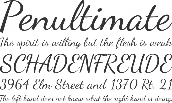
I would prefer it to be bolder.
And the small "a" is problematic: "aim" looks bad. "an" looks good.
But overall well done.
i like the handwritten look of it, but I agree that the small a is a little weird. Good job!
I actually find it better than the original font, good job ![]()
I don't think that it necessarily must be bolder.
The bottom part of the small "b" looks too 'handwritten-like' for me though, the "a" seems fine for me.
i feel that its bringing down the look of the journal and is not needed nice idea but wrong font
yahgiggle, do you have any suggestions how to make the font better? I will try to consider all comments and suggestions...
its only my opinion my friend i do like your idea but maybe that font is a little too kiddish if you know what i mean, maybe join the letters or something like this

You offer to make the font more stricter?
Don’t have an account yet? Create a new account now and be part of our community!

